
Artwork Setup Guide
To get the best results from your print job, it’s important to supply your artwork correctly.
Below is a quick guide to help you understand the essentials. Along with guides that you can download.
Please feel free to download a PDF or InDesign guide to get you started.
Key Terms to Know
-
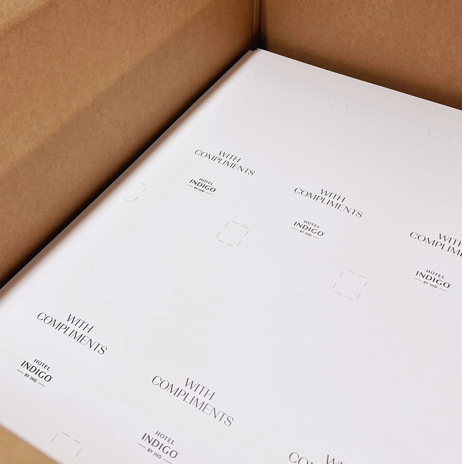
The extra area around your design (usually 3mm on each side) that ensures your artwork runs cleanly to the edge of the page when trimmed. Without bleed, you risk getting thin white borders around your design.
-
Trim
This is where the fi nal cut is made. Anything beyond this line is removed, so your fi nal product is trimmed to size. It’s the edge of your fi nished piece.
-
A buffer area inside the trim line (usually about 5mm) where important content like text or logos should stay. This ensures nothing essential gets cut off during trimming, especially if there's any slight shift in production.
-
Small guide lines placed just outside the corners of your artwork that show us where to trim. They're vital for precise fi nishing and won’t appear on the fi nal piece.
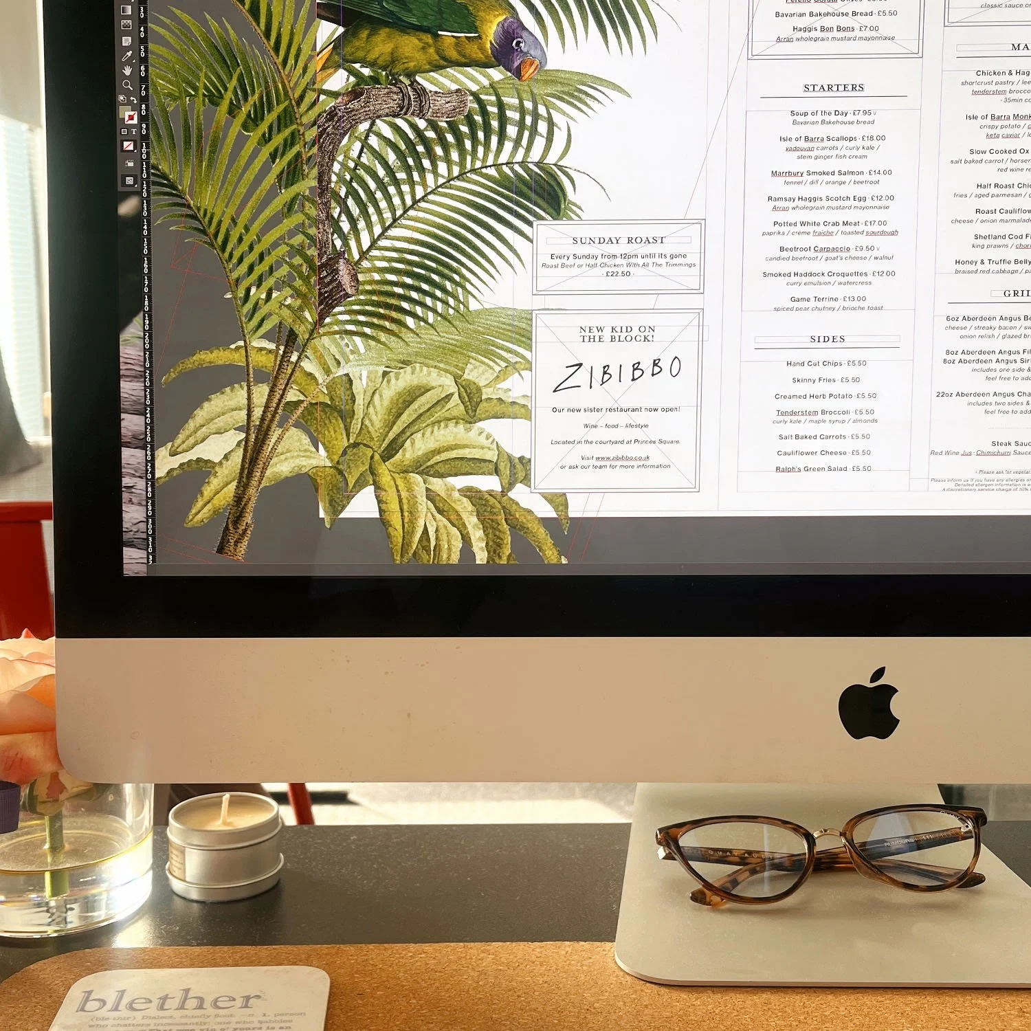
Setting Up for Print
-
Please supply your artwork in spreads with the outer spread on one page, and the inner spread on another.
The front of your print will be on the right hand side, and the backpage will be on the left.
-
We require your artwork to be supplied in single pages. Each page requires 3mm bleed and crop marks on all 4 sides.
Please ensure that your bleed on the spine is consistent and doesn’t contain colour/design from another page.
If you switch off facing pages in inDesign, you’ll be able to move your spreads apart enough for bleed to continue around each page.
-
Please outline all text and supply your artwork with 3 views on 3 separate pages in a PDF:
Artwork & keyline
Just artwork
Just keyline
Ideally cut marks should be in RED, and creases in GREEN, but we can help here so don’t worry too much - as long as it’s clear that there is a difference.
-
FAQs
We’ve gathered some of the questions we’re asked most often about artwork, printing, turnaround times and delivery.
-
Glossary
Our glossary explains common print terms and setup tips to help you prepare your artwork with confidence.
-

Contact
Got a project in mind or need a quick quote? Drop us a message - our team is always happy to help!